Italian wineries invest heavily in hospitality and architecture, yet consistently neglect the one space with the highest profit margins: the shop. Poor visual merchandising, flat lighting, and absent signage undermine even the finest bottles. Drawing on international best practices, this article identifies seven concrete areas where winery retail design directly and measurably increases average transaction value.
Italian wine tourism has never moved so fast. Numbers keep growing, wineries invest in architecture, hospitality, experiences. Yet there is a point where all this work risks failing to convert into real economic value: the shop. The place where the visitor should become a customer, and the customer a loyal one. It is the highest-margin channel a winery can manage, and it is often the least designed of all.
The most profitable channel in the winery is also the least designed.
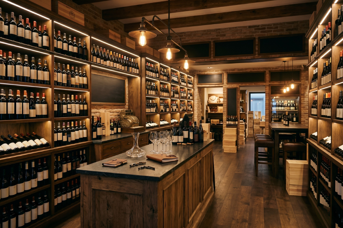
Every time I walk into an Italian winery wine shop I feel the same contradictory sensation. Before my eyes are bottles that are the result of decades of work — and then I look at the space in which those bottles are displayed, and I realise that the story, inside there, simply stops. The shop becomes a warehouse with price tags. Shelf after shelf, with no visual hierarchy telling the visitor look here first, no lighting to enhance the premium bottles, no label that translates the complexity of the wine into something useful for someone deciding whether to take that bottle home or the one next to it.
What I have seen outside Italy
Those who have had the chance to visit wine shops in Napa Valley, South Africa, Australia, or even simply the flagship stores of the great Champagne houses, know exactly what I mean. There, the shop is not an appendage of the visit: it is the point where the visit turns into economic value for the winery, and it is designed with precisely that awareness. There is a direction. There is a constructed visual journey. There are thematic areas that speak to the customer in their own language. There is a light that decides what you see first. There is a counter that is not merely a cash desk, but a final, fundamental point of commercial activation.
It is not a question of budget. I have seen small wineries in South Africa manage their shop with a level of visual merchandising care that in Italy we find only in luxury mono-brand stores. It is not a problem of resources: it is a problem of retail culture.
Why Italian wine arrived late to this field
For decades, Italian wine lived on the strength of its territories, its native grape varieties, the network of importers and distributors that did the positioning work outside the winery. Direct-to-consumer sales through the in-winery shop only exploded in Italy over the last decade, driven by wine tourism and the discovery that direct sales are one of the highest-margin channels a winery can have. But we started managing that channel with a producer’s mindset, not a retailer’s. We kept displaying instead of starting to design.
Meanwhile, outside, wine shops have become one of the most studied spaces in food and beverage retail. Layout, hierarchy, signage, visual cross-selling, sensory atmosphere: each of these elements is curated the way a fashion collection is curated in the flagships of Via Montenapoleone. Because someone who walks into a winery shop is already positively disposed — they have just had an experience, they have time, they have curiosity.
The seven things that truly change the shop
When we work with a winery on visual merchandising, there are seven areas we address, and they are the same ones the great international brands focus on: orientation and customer flow in the first five seconds after entering; the visual hierarchy that determines what is seen first, second, last; display methods; the counter and cash desk as a zone of commercial activation, not merely service; the tasting area as a lever for memory and conversion; signage, labels, lighting and sensory atmosphere; and finally, visual cross-selling and up-selling.
It seems obvious. It is not. Because each of these seven areas, taken individually, shifts the average transaction value by a few percentage points. All together, done well, they shift it in a way that no traditional marketing lever can match.
Fitting out your wine shop well is not only a matter of sales. It is also a matter of respect: towards the wine you produce, towards the work behind every label, and towards the visitor who chose to make the trip. A sixty-euro bottle displayed on an anonymous shelf, under flat lighting, with no label to offer a key to understanding it, is a bottle whose dignity we ourselves are the first to take away. And if we do not give it that dignity, we cannot expect the customer to recognise it.
Visual merchandising, in the end, is this: the physical translation, within the retail space, of a winery’s identity and the care it puts into its product. It is the point where the brand stops being a conversation on a website and becomes a three-dimensional experience.
Key points
- The winery shop is the highest-margin sales channel, yet consistently the least designed space on the property.
- International wine regions like Napa Valley and South Africa treat the shop as a core commercial conversion point, not an afterthought.
- Italian wineries adopted direct-to-consumer sales only in the last decade, still applying a producer mindset rather than a retail one.
- Seven areas, from visual hierarchy and lighting to signage and cross-selling, each individually shift average transaction value upward.
- Good visual merchandising is an act of respect: toward the product, the team behind it, and the visitor who made the journey.